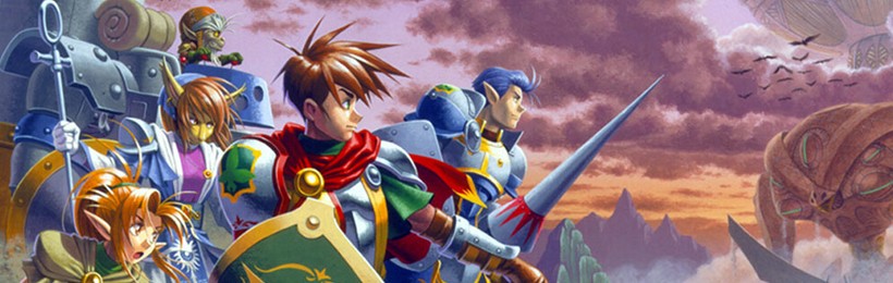
Introduction
This article is half of an in-depth look at the videogame "Shining Force III" for the Sega Saturn. This is a project between me and my brother at Prosody.co.uk. We'll regularly be examining games to see what makes them tick, and what lessons game developers can learn from them. My articles will take a more analytical approach, whereas his will focus on the game from a player's point of view.
You can read the other half of this article at: Player POV – Shining Force III.
What makes it great?
Simple Mechanics
The statistics in the game are simplified so that the player isn't blinded by reams of numbers. A lot of the more complex elements are hidden from the player, which allows the player to get on with enjoying the game.
Data hiding like this allows the more "hardcore" players to experiment with the inner workings of the game. Layering helps to keep casual and hardcore players interested in the game, and can be a reward for the "hacker" type of game player that likes to learn the game inside and out.
Simple Interface
The overall interface is very simple, and consists of a menu containing four icons organised in a diamond formation. This is optimised for the controller, as the player only has to press one direction to choose an action.
There's often a temptation to map commands to every button on a controller, and with a keyboard, this becomes especially tempting. Try to keep things as simple as possible. Remember – if in doubt, leave it out.
The rest of the GUI is simple too. Hovering over a player shows their current health, level and any adverse status effects. The screen is generally free of clutter, which lets the player get on with actually playing the game instead of fighting with the interface.
Keep it simple! This is difficult for developers, and interface design is an art as well as a science, but spending quality time designing and testing your interface will really pay off in the end.
Subtle graphics
SF3 is old, but still retains an interesting charm to its graphics, in a similar way that the 16-bit SNES RPGs still look attractive today. It's all too easy to be caught up in the graphical arms race, but it can be a real hindrance to progress. You don't have to look far to find projects that are still caught in the "make a 3D engine" phase. Concentrate on making the graphics functional and subtly beautiful, and you'll have a more charming game.
We all know that gameplay is the important element, but it's a lie to think that graphics aren't important. They don't have to be spectacular, but they do have to be interesting and complimentary to the experience.
What's bad about it?
It's linear
Like nearly every RPG, SF3 suffers from being quite a linear experience. Although you can explore towns at your own pace and use any strategy in battles, the game is still a very linear progression from one story point to the other.
Relatively poor replay value
Because the game is linear, there something of a lack of replay value. Once you've played a battle, you know the surprises and can adjust your tactics for the next time you play it.
The developers have tried to combat this problem by including secret characters and a variety of interesting weapons and items.
The main reason the game is still playable after the game is complete is the fact that every battle plays differently. Even though you'll know some of the surprises, you can still experiment with different tactics and different team members.
So what can we learn?
What lessons can be learnt from this? What can we learn to improve our own games with?
There's a TONNE of work involved in making an RPG!
It's a shame that RPGs are so popular with indie developers, because there's a tonne of work involved in creating them! It's not just the quantity, but also the quality that's important. Music needs to stir the right emotions, graphics need to convey the right mood and the little details need to be added to sew the game world together. It's a big job, that's for sure.
Focus on the fun parts of the gameplay.
RPGs generally have two modes: exploration and fighting. It's important to pick a few elements that make the gameplay fun, and work on optimising them as much as possible.
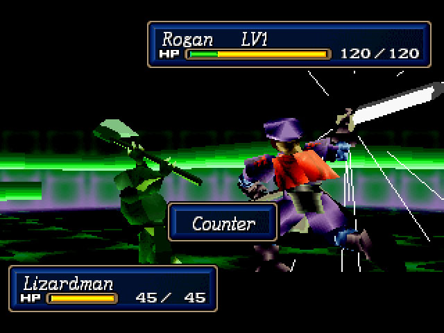
The main element of the battle system is finding a strategy to outwit the AI opponents. Do you rush into the battle and attempt to take out the key enemies, or do you draw them out into the field and attack them from the sides?
For example, the battle terrain in SF3 has a "land effect", which means certain characters can move quicker or slower on different terrain. It also affects their defence stat, so sometimes it's better to attack via a forest as it provides a higher land effect and thus increases your defence, giving you an advantage over your opponent. This simple, easily overlooked element can add an extra layer of strategy to your game plan.
Instead of weighing the game down with a tonne of different features, the developers concentrated on making the battle mode as immersive and appealing as possible. Like chess, every game plays differently and every opponent requires a different strategy to beat. It's easy to add hundreds of features to make your game sound more appealing, but refining the core elements of the game are far more rewarding.
Use details to immerse the players
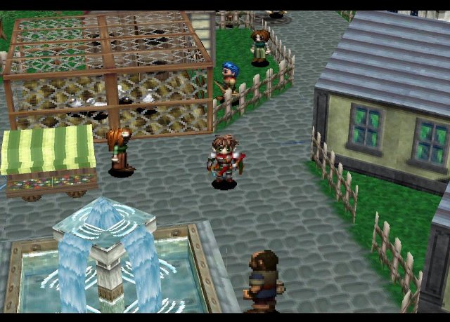
Even simple things, such as washing lines in towns and vases on tables help to capture the player's interest, and make them want to spend more time exploring the game world. This can be difficult in a large scale game such as an RPG, but for a smaller indie project, more attention can be spent on getting the details right. This is the layer of "polish" that helps make your game stand out, and is really an area where the developer can let their creative side shine through.
Concentrate on the useful features
I know it's difficult, but always concentrate on the useful features of the game before moving on to the "exciting" ones. Stick to what's useful when it comes to designing the User Interface, and don't be tempted to add superfluous "cool" features. If in doubt, ask your audience. In fact, ask your audience anyway because they'll almost certainly tell you what parts of the interface could be improved.
Progressive Rewards
As the player progresses through the game, reward them! SF3 does this by gradually adding more powerful and interesting weapons to the player's arsenal. New enemies and spells are also provided to keep interest, and by the final stages of the game there is a really diverse range of weapons and spells for the player to use in battles.
Characters learn new "special" moves, and the appearance of magic changes as it increases in level. This can drive the player forward, as they want to see what new things lie in store for them. Although the story is the driving factor behind the entire game, these extra bonuses drive the player through the actual game play experience.
Let the players take risks
One of the interesting areas of SF3 is the Smithy. You find chunks of "Mithril" and "Dark Matter" lying around the world, and a smithy can craft these elements into weapons and armour. However, you don't know what item you'll get, so you may get something new and cool, or you might get something you've seen before. This kind of risk taking helps to create interest.
The other interesting element is "cursed" weapons. These weapons are generally much more powerful than regular weapons, but they have some nasty side effects. They may sap your health when you attack, or you may be paralysed by them and unable to attack at all. This feature lets the player take the risk – do they think a sky high attack value is worth the risk of being paralysed for a turn?
Risk taking is part of human nature and can make the experience far more compelling (just look at gambling) so make sure your players have ample opportunities to take a risk to reap big rewards.
Ease players into the experience
Complex games often come with a "tutorial mode" or a "training level" to help the player get used to the experience. It's important to handle this correctly, as it can create a barrier between the player and the game. Will you really believe you're a gallant knight slaying a goblin if the screen is constantly filled with tips like "Press X to attack" and "Use the mouse to swing your sword"?
SF3 starts with a simple "explore the town" stage, which gets the player used to the exploration aspect of the game. It then shifts to a quick (and easy) battle to allow them to experiment with the battle mode.
Indie games can often swamp the player with hints as new elements are added, sometimes to the detriment of the gameplay experience. Think carefully when creating your training mode, and make sure it doesn't detract from the game play. Indie games have a difficult time, because they generally don't come with a printed manual, which makes it harder to tell the player about the game without dragging them through a tutorial.
If you want to be really smart, try and work out if the player is struggling for a while before showing a tip. For example, if they haven't reloaded for a while, show a tip that tells them how to reload. One thing – be very careful about modal dialogs. These require the user to perform an additional action to remove them, and they can become VERY ANNOYING, VERY FAST. You have been warned.
Want the player's point of view?
You can read the other half of this article at: Player POV – Shining Force III. It takes a look at the game from the player's perspective, and looks at how the different game elements fit together to create an immersive RPG.
3 Comments
Enjoyed the article : )
Oh wow this font in the textbox looks like shining font haha cool.
Shining force is a very good game,i think…..
And i am intersted in downloading game,and if it can be free i will bi much happier than now
Shining Force III Articles | The Shining Source